Configuration for mobile version
Top menu elements
The top menu is determined and configured in the share-header.get.js files. In addition to the original file (defined in alfresco), these modules contain the extensions with the same names:
- …/header-community/share-header.get.js
- …/header-ecos-enterprise/share-hdeader.get.js
- …
Element hide
There are several overloaded templates that can hide the elements depending on the screen width. For this purpose it is necessary to set the parameter movable in the widget configuration.
Moreover it is needed to specify the other template name in alfresco 5:
- js/citeck/menus/citeckMenuBarItem
- js/citeck/menus/citeckMenuGroup
- js/citeck/menus/citeckMenuItem
Mobile Menu
Mobile version of the top menu is in fact the simple dropdown list. It is getting visible when the screen is downsized whereas all elements in the top menu are hiding, and conversely.
All element of the top menu in mobile version are duplicated and located in the widget with HEADER_MOBILE_MENU_VARIANTS. identity. In order to transform the existed widget in the adapted one for mobile version, there is the method toMobileWidget:
Cardlets
For mobile card the visibility and location of cardlets could be configured.
The cardlet can be hidden when using the portable device in case of the function “Available in mobile version” is switched off.
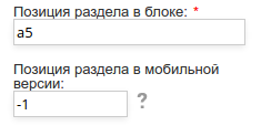
The cardlet location in mobile version of the document card is given in the same way as in the field “Section location in the block”. If you want the component to be located according to the current order, just leave the field empty or set “-1”


